Menu Arrow Hover
Brief explanation:
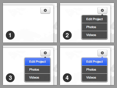
1. Menu button
2. Menu open
3. Menu link hover = "meh"
4. Menu link hover = "yay"
One thing that irks me about dynamic drop-down menus that have little speech bubble style arrows is that weird cutoff between a hover-state, and the menu arrow itself.
On a recent drop-down menu I made for our (not yet launched) PureCharity.com UI, I decided to make the arrow respond to hovering the first menu item. I did that via...
———
.action-menu li:first-child a:after { }
.action-menu li:first-child a:hover:after { }
———
It's a subtle difference, but to me it's the little details that push UI elements beyond the realm of "good enough."
FYI: We're using the Pictos font for the gear button icon, and elsewhere in the app also. 'Tis pretty sweet.