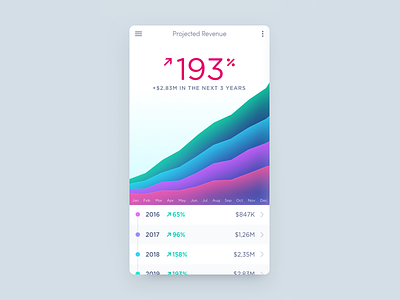
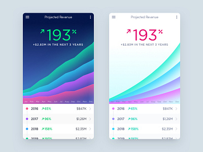
Hybrid Mobile Analytics
Looks great!
Depending on the brand and overall look of the app, I could go with either dark or light versions.
The light version however has the graphs a bit lighter. It needs a bit more contrast. I like better the palette from the dark version. How about a hybrid of both? Light version + dark version's graphs.
More by Cristi Rus View profile
Like

