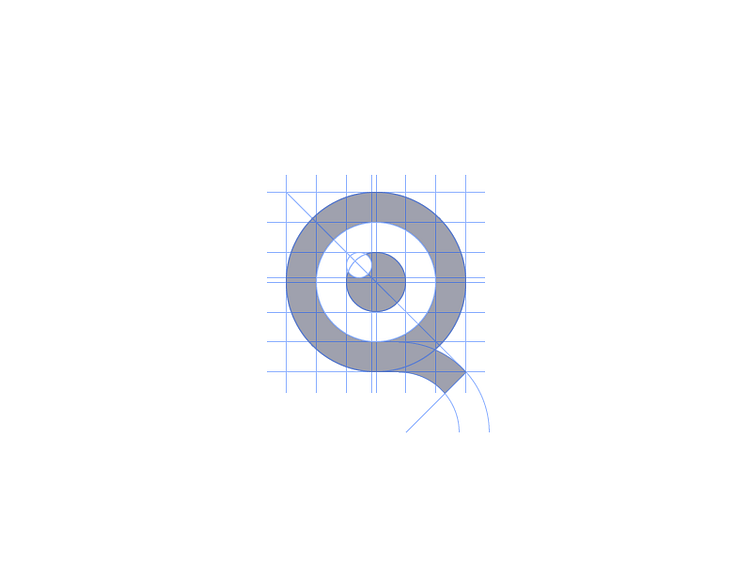
Q Construction
Unsure on the best way to visualise guidelines on these shots. Obviously want to get the guides spot on BUT because of working to the pixel either:
1. I work with 2 pixel width guide lines. (which I don't want to do)
2. OR guides are unnoticeably slightly off. (which I've done to keep it all sharp but annoys me knowing its slightly imperfect)
3. OR artwork is placed on the 0.5px so 1px guides appear sharp. (which I don't want to do)
Identity created for Quote Detective, combining the letter Q and an iris to suggest a magnifying glass.
Created with www.ourethos.co.uk
More by Jonathan Bellamy View profile
Like

