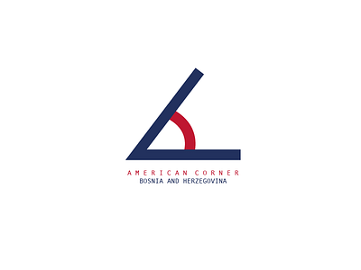
American Corner - Bosnia and Herzegovina
Got this simple minimalistic idea for redesign of American Corner logo in Bosnia and Herzegovina.
Its combination of two letters A and C, and the C as a degree.
Here are current AC logos around the world.
https://www.google.ba/search?q=american+corner&newwindow=1&safe=off&espv=2&biw=1152&bih=1055&source=lnms&tbm=isch&sa=X&ved=0ahUKEwidgcmKvbfRAhUErxoKHaj7AvgQ_AUIBigB
More by MURIS H. View profile
Like
