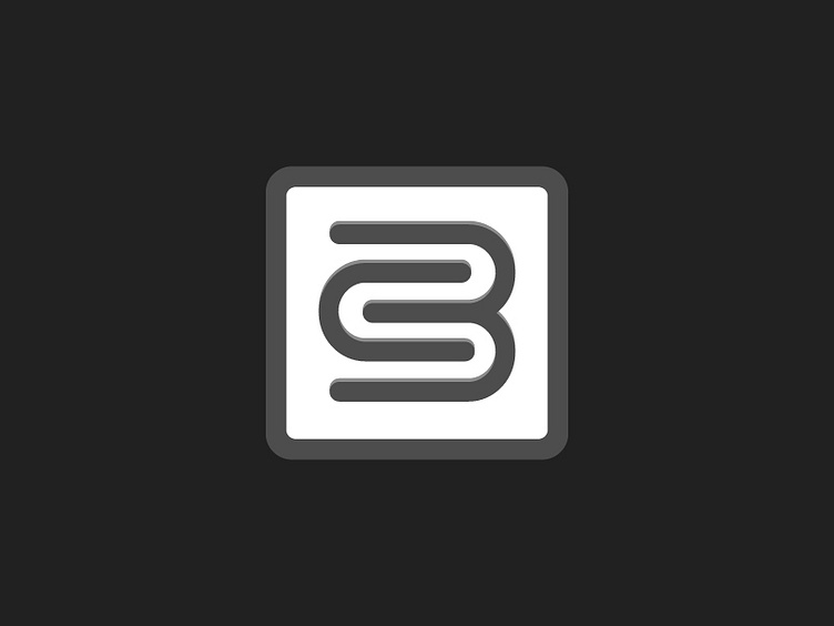
BS Logo Mark
Unused mark for a recent client project. The client's name consisted of two words beginning with the letters "B" and "S". It became quite the challenge due to the fact that he wanted me to avoid "BS" in his logo, for obvious reasons!
As with several projects, the client ended up choosing an option that took me the least amount of time but I still favored this mark. Thoughts?
More by Blake Breaux View profile
Like
