Mikatasa Architectural Design & Build
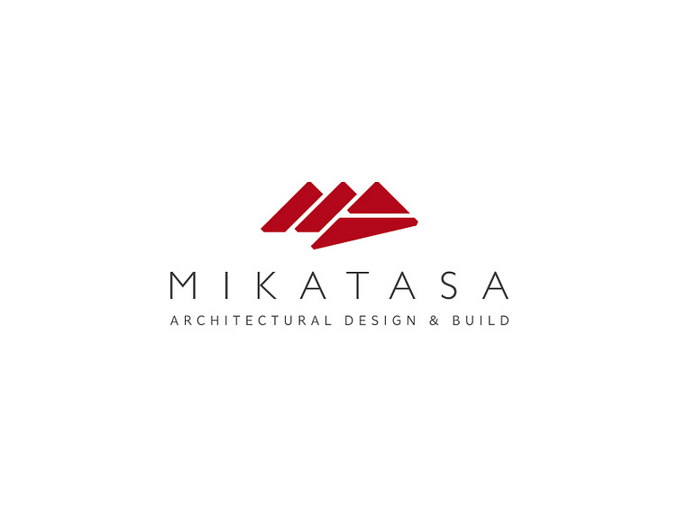
I submitted this logo design a few years ago now, but it was rejected. The company wanted something strong and architectural, whilst also using the initials 'MA' and the colour red.
I created the letter forms using triangular shapes (the strongest shape in construction), overlapping them to create depth and separate the forms. I then used a slightly deeper red than was expected, in order to move away from the usual danger association.
More by Paul Goodman View profile
Like
