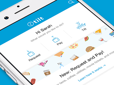
Updated Navigation UI + education cards
With our latest "Pay and request" feature addition to our apps we had to re-think our main navigation and architectural structure.
Surfacing our three main CTA's right at the top instead of having them 2 taps away under a big plus icon in the bottom navigation bar was a big but positive change. #simplify
Happy about the end-result!
The educational card is a nice component to re-purpose in the future for new feature release, better on-boarding and similar announcements.
Press L to show some Love!
Learn more about tilt here
More by Tilt View profile
Like
