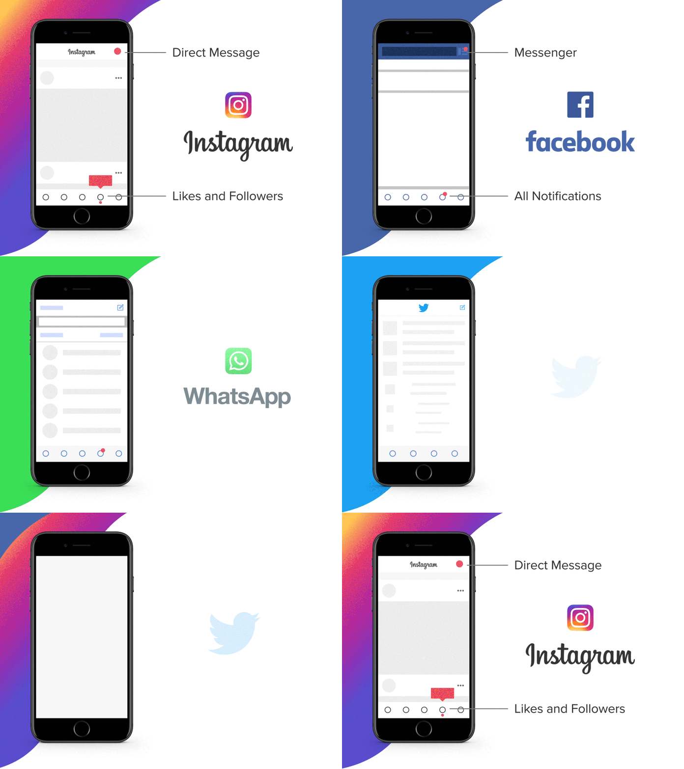
UI Continuity of Social Media Apps
Check out UI/UX Interactions Collection on Behance.
UI Continuity of famous social media apps.
UI that I have pointed out are actually one of the most tapped region of the device. Might be the first thing user do is to tap on any of the icons. Same region and most useful operation.
I have following questions that I would like to hear from you.
1. Should we go beyond this scenario while designing app?
2. User experience is most essential part of designing app and what if we break the pattern?
P.S. Study purpose only! Hit L if you like the transition of App Interface.
More by Paarth Desai View profile
Like
