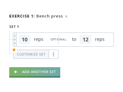
Workout set form UX
Working on a fitness app in my free time and ran into an interesting UX challenge for how to create an advanced set (superset, drop set, to failure). Couldn't find a good example out there now so this is what I came up with this. The orange dots are going to be tooltips for onboarding.
Would love feedback on if this makes sense!
Also, which button do you like? The analog-esque one or flat?
More previews coming out soon :)
Like

