Graphing Confession
I have to make a confession. I hate data visualization. Graphs, charts, infographics, useless academic Edward-Tuft-inspired data-vis projects (zing!)— all of it. Can't stand it. Aaand that makes this Dribbble shot that much more awkward, because it's all about designing a graph. #facepalm
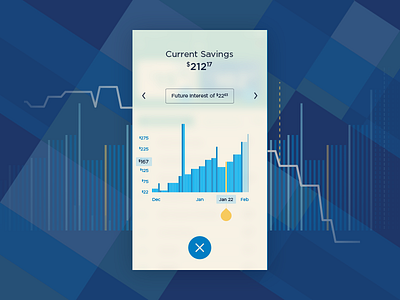
For Nickel, we needed to visually represent the balance of the child's saving's account over time, both in the past and into the future (projected). My task was to design the visual aesthetic in addition to the interaction. I spent countless painstaking hours in Illustrator, working with various bar weights, color combinations, and opacities. The tough part about designing something like this is that it's a naturally rigid artifact. It's a system within itself, full of rules and finely tuned parts that complete the whole. And as we all know, rigidity and an overabundance of constraints can easily become the enemy of free thought and creativity.
In the end, we came up with a design we felt good about. Checkout the attachment for some of the variations I came up with.
PS– Huge shoutout to all the data-vis designers out there. You have a tough job and I have mucho respect for your skills. Keep up the hard work!

