Portfolio relaunch
I'm looking for a full-time web/product/visual design position in Chicago!
✨
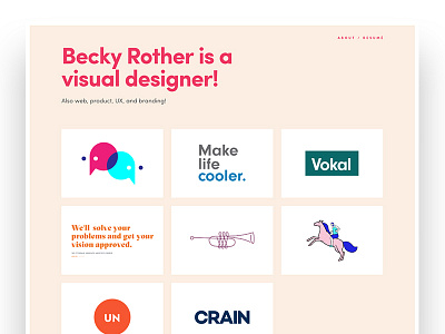
It's 2017 and I'm a professional, gosh darn it. It was time for my website to say that, too. So I'm using a more neutral color palette with just a pop of pink and a lot more white space. I updated the typography as well: the combination of playful sans-serif and a serif with a lot of personality mirrors the intention set by the color palette and keeps the site from feeling too stodgy.
On case study pages, I'm using more (hopefully) coherent sentences to describe my process, and quick-hit sidebar information so you can see my role in each project even easier.
✨
More by Becky Rother View profile
Like
