GameTyrant — Dota 2 NAO Logo
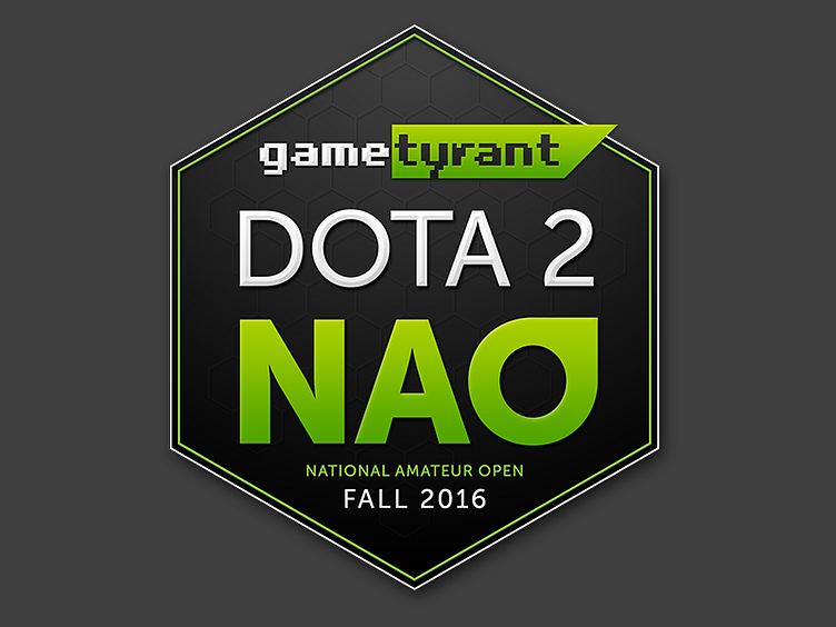
This was a really hard logo to balance. It's so type heavy. It had to look good as a small size, but also have enough visual detail to look good when animated for video bumpers.
This was a really hard logo to balance. It's so type heavy. It had to look good as a small size, but also have enough visual detail to look good when animated for video bumpers.
