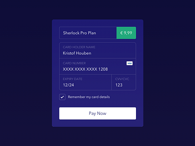
Daily UI challenge #002 – Credit Card Checkout
Daily UI challenge #002
I opted for a simple dialog that looks trustworthy and is easy to scan. A checkout flow should be transparent to the user and take away any confusion that is left.
More by Kristof Houben View profile
Like

