Font Book
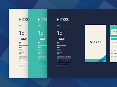

Earlier last year, I helped out with a new financial app for teens and parents called Nickel, more on the concept another time... One of my tasks was to nail down the right font for the app. I ran a font study that compared various typefaces at different weights, sizes, and contrasts against various identity elements and in various UI contexts. I presented my findings in a font book (pdf) format that made it easy to flip between typeface candidates.
In the end, we went with a terrific relatively unknown font called Gibson. It's a nice alternative to Gotham, has distinctive number forms— important for a financial app— and matched some of the bold character and geometry of the Nickel identity.
Fun note regarding process: In an ideal world, you'd have the fonts, along with the rest of the identity system, figured out in advance, before your sketches and wireframes are converted into hi-fi mocks; however in the startup world, things are seldom ideal or linear. This was the second time I've had to select a set of fonts halfway through the development of a new app— and I've actually found it to be a very pragmatic approach. Identity systems look great on paper and in presentations, but predicting how it'll play in the real world and amongst UI elements is next to impossible, especially true for your fonts. Being able to select them after seeing it in a real set of mockups— or even better, in the actual app itself— is the only way you can be sure you've selected the rights fonts for the job.