Absolute Logo Rebrand
Okay, so I submitted a design that was a highway sign for this company called Absolute Traffic Services / Sign Solutions (Sister company of Traffic Services).
They're kinda in a weird transitional phase with regards to the rebranding of their logo. We have a new GM (General Manager) who doesn't like the current design (nor do I) and since I'm the only designer who works there I was given the task to rebrand them. I've gone through a lot of different revisions for these guys and just when I was about to throw in the towel they finally decided on this identity.
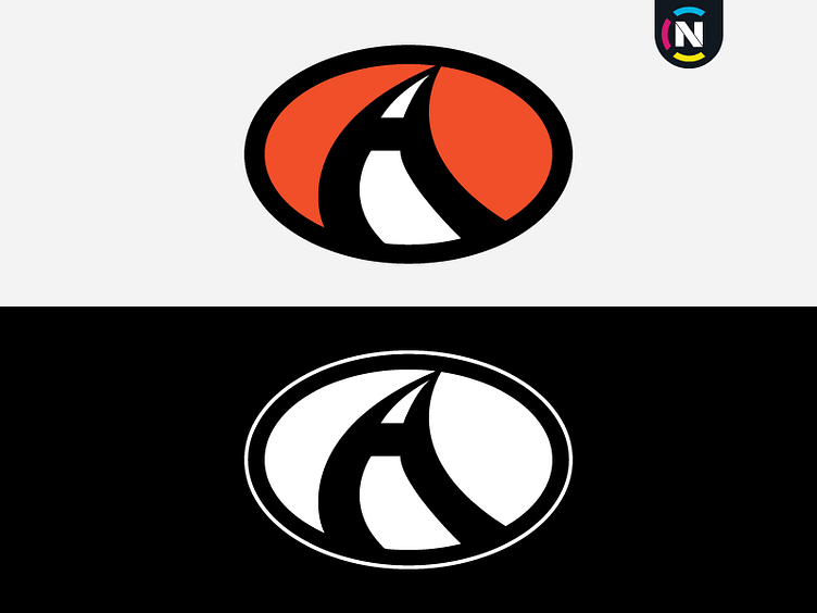
Since they're a company that not only makes traffic and custom made signs but also deals with road traffic I decided to incorporate both a road and the letter "A" as one piece.
The colour orange represents the orange used in construction signs.
Again, bring on the feedback both positive and negative. I love hearing what other people's thoughts are.
Enjoy,
CN
