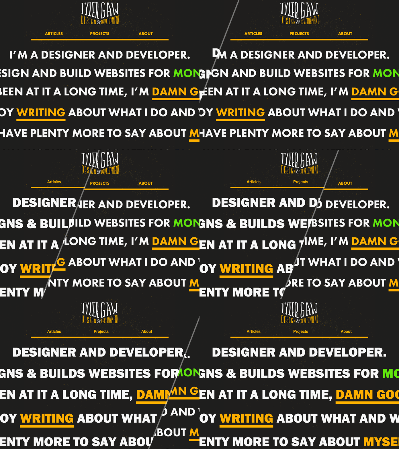
tylergaw.com Home page before/after
This is a before/after reveal of the home page of my personal site. I took part of a day to revamp the typography.
I was using Futura (with text-transform: uppercase) for headlines and navigation. And Georgia for body copy. It worked for a while, but was feeling stale. My main goal was to introduce more typographic variety.
I chose Franklin Gothic for headlines and navigation. Instead of using all uppercase, I limited that to main large headlines. For navigation and less important headlines I used normal title case. I feel like it makes every page more dynamic, more interesting.
Franklin Gothic has more of the feeling I was going for than Futura. It has more oomph! It also has more interesting letter forms.
For body copy I chose Freight Text Pro. Georgia is a work horse, but is limited in its range. Freight Text gives me more room to vary the style and weight. I'll do more fine tuning with my usage of it over time.
Check it out: https://tylergaw.com


