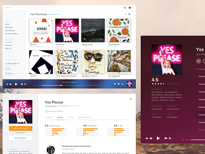
Audible Redesign (Desktop App)
Another Fake Project on Dribbble, huh?
Okay, so I'm not that designer. You know, the guy who redesigns every new logo the day it's announced. Who only posts fake projects to their Dribbble. Yeah, that guy.
But I also don't want to be that other designer. You know, the one who always overthinks the fun stuff. The one who by committing themselves to running a sustainable business, loses the joy and wonder of freewheelin' design. Over the past couple years I've developed into more of UX designer/business owner hybrid. This means way more team meetings, client reviews, flowcharts, personas, prototyping, and user testing than inspired pixel pushing.
Meet my first "fake project"
I chose Audible because I love Audible and use it often. They don't have a desktop app, so that seemed like an interesting challenge.
Truthfully, there are glaring UX issues that bother me much more than its disheveled aesthetics. But I'm not here to tear down their full UX. Although, yes discoverability within Browse is pretty awful and the My Library view is so overloaded with irrelevant information it buries primary calls to action… but I digress.
Less than 24hrs… go!
My goal was to identify three views I wanted to address. And then do that during my spare time over a 24hr period.
Conclusion: It was a fun exercise! It really challenged me to hone in on micro vs macro. I'm not solving all of Audible's problems, working through all the edge cases or considering all final environments. Today, I had fun with design. Hope you enjoy!
I do have a UX question to throw out there.
On their current mobile app, besides play and pause Audible replaces all media controls with "rewind/fast-forward 30 seconds". In that context, this 100% makes sense.
You'll notice in my attachments, the media player has these controls instead of the fast-forward and rewind. A user can scrub with the play head to manually fast-forward within a section. I have kept the skip next/previous for easy navigation between chapters.
Ultimately, I prefer this approach given the content. But the "30" text label crowds the icons, even though I think labeling the controls is necessary. Thoughts?
Disclaimer: This isn't meant to belittle the hard work the Audible team has put into their product. Designing a couple screens for fun is a world away from shipping, managing, and iterating upon a real product.


