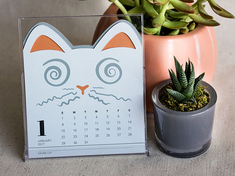
Cat of the Month Calendar: Drunk Cat
A closer shot of one of the designs for the cut-out desktop calendar collaboration I worked on with yozhikandco (https://www.etsy.com/listing/500530731) Each month stacks over each other so that the ears change colors.
As I began thinking about the concept, I knew I wanted to make a calendar that would not be focused on US-based holidays, as well as something that could be attractive to all ages and genders.
Approaching the project, I first asked myself what I would want to see on my desk every single day. I think that most people buy products because they have an emotional connection with them, no matter what kind of community or sub-culture they identify with. I thought of the calendars people create online with photos of the people they care about. Then realized, it might not be people at all. I love my cats like I would any other family member, and if we have learned anything from the internet, it’s that people love their pet videos. So I landed on the theme of cats. I knew having the die-cut for ears would in itself speak as a long distance “poster” and also work as a cut-out design every month.
While designing the calendar I realized the more complicated and intricate I made the cuts for the faces and ears, the less it looked like a cat. Having too many layers show through posed the problem of too many colors vibrating against each other, and having too few colors in the design didn’t give the emotion and presence I felt each month needed to stand alone. Making the cat faces change in size also started to take away too much real estate for the calendar text, so it would sacrifice the functionality of the design. If it became too abstract, I worried that the customer wouldn’t connect with each month in the same way, and it might dissuade someone from buying.
It was a simplification of my initial ideas, that created the end product where the illustration really became the main focus and the die-cuts and color changes supported them. I needed to consider the end-user who would be seeing this calendar in their space every day. I couldn’t “degrade” the design after it was flipped each month just because it looked great for the beginning of the year, but the end of the year it wouldn’t be as engaging.

