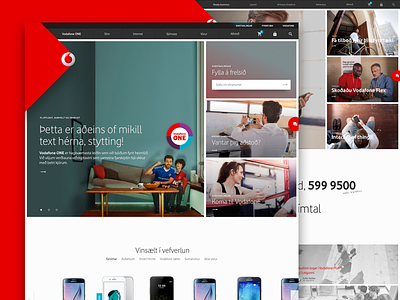
New front page for Vodafone
We were very happy to get the call from Vodafone Iceland to come and do some work on their sites front pages, as they have 3 you know.
Most of the work was around simplifying things, reducing vertical height without sacrificing informational value, basically more stuff, but cleaner and simpler, pretty simple right? The most drastic change was to the mobile version, will post that soon.
We really liked the result as did the good folk at Vodafone.
Press L for love y'all
More by Júní digital View profile
Like


