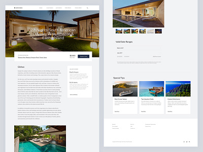
Travel Platform — Details Page
Hello friends!
I am sharing with you a preview of a details page for a travel platform. This page has a lot of text so I put a lot of attention to typography. I choose serif typeface for a body text and sans for headlines and smaller copy sizes. With redesign, I wanted to achieve modern and contemporary look & feel, with a lot of whitespace in the layout, placing priority information in focus.
Let me know what you think!
More by Hrvoje Grubisic View profile
Like

