Cluster Capacity Charts
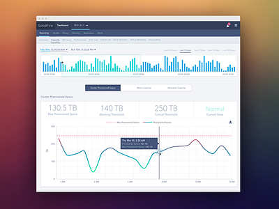

This screen was designed to help storage admins analyze performance in order to find trends or spikes. After trying out several chart types, we decided to go with the gradient line chart. Notice how the line changes color depending on how close it is to the dotted Max line.