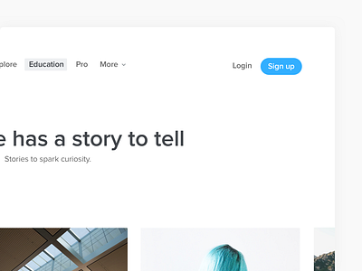
Sutori new UI
In October🎄, I joined as a designer Sutori a small startup in San Fransisco who created an amazing product for education.
The identity had been done at the beginning of the adventure and was now a little bit old. This is why we have decided to start again from the beginning, starting from the drawing in order to create a new brand and a new experience. We had two months to do this rebranding and redesign of the application.
During the redesign of the identity we worked at the same time on the new website and the application. We wanted a clear and easy to use interface. The objective of this redesign was to simplify at maximum the use of the platform in order to make it more natural during these weeks of working on redesign and interactions, some designs appeared better (colorful, helpful, animated, simple).
This shot is just to show you a little bit of the new UI I did🎒
Don't forget to give me your feedbacks 🤘🏻
