"AHA!" Moment
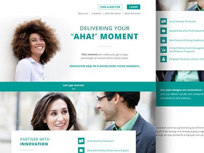
This is an initial idea for a health company website redesign. They wanted a modern fresh site that would be easy to navigate since they are a company the works with employers, members as well as brokers; so it needed to reach across all three of those audiences without making one feel more or less important. They predominantly use squares in their collateral as design elements, so I wanted to bring that geometric feeling to the site.