Type design in progress.

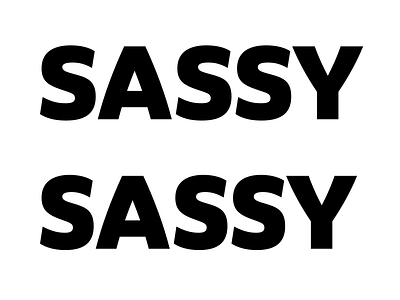
Type design in progress. Which 'S' looks better? The ones above, 'wider', or below, 'narrower'? And what about the other letters?
Type design in progress. Which 'S' looks better? The ones above, 'wider', or below, 'narrower'? And what about the other letters?