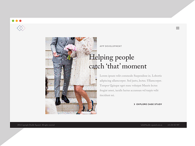
Case study splash screen
Quick design practice at playing around with the use of minimal colours (e.g. black/greys), natural lightened photo and offsetting/overlapping the grid.
Each one of these introductory snippets would highlight the benefit/goal achieved for each case study quickly. In addition to the area the 'agency/freelancer' worked in with a link off to continue reading the case study in detail.
I'd imagine I would implement a subtle fade in and soft parallax thing going on here to complement the minimal take/feel of the page.
Feedback welcome!
More by Ben Low View profile
Like
