Comic Sans Challenge / UI Challenge — Week 08
Hi all,
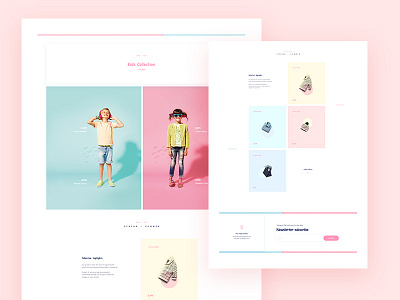
This week assignment was Comic Sans Challenge.
The challenge was to make landing page, web or some kind of presentation as long as you use Comic Sans and Comic Sans only (regular and bold). Goal was to come up with a way to where Comic Sans could be used, and work given its personality.
My idea was to push Comic Sans in not so natural environment. I tried to typeset it as much as possible, use extensive kerning and one of Comic Sans characteristic; that it works good on a small sizes and renders properly. I must say it was a fun challenge :))
If you are interested and willing to participate in the future weekly UI challenge hit me on: mario.sestak@degordian.com
Every week we will send a small assignment, with simple rules to follow.
Why module / component?
Because it is small and you focus on details.
Why weekly?
Because there is enough time during the week to make it, and of course it is great discussion starter on our weekly design meetings.

