Icon Components
A little behind the scenes at how I implemented our icons. All icons are built within a 32 x 32 pixel grid. Then I maintain an icon sheet detailing the use, location, and expected visual appearance of each icon.
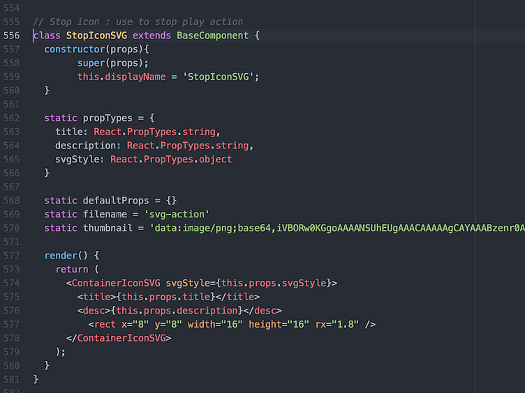
When a new icon is needed one of the designers adds the path information into the icon component along with any relevant information (ie. comment about how to use, displayName, etc.).
Organization of icons is based on how the icon is used. For example we have a navigation icon component that just contains icons for navigation, and a content icon component that contains icons for communicating content. I'm still not 100% sure that the categories we've created will make sense over the long term, but the modular approach of the whole setup should allow flexibility to change it in the future if need be.
A global class wraps the SVG path data for each SVG icon. The global class contains relevant SVG tags, and props like fill, title, description, etc. the props are controlled by the children components.
I don't often get my hands into code these days, but it was great to jump in, and develop how we handle icons. It's definitely significantly better than symbols, or icon fonts.