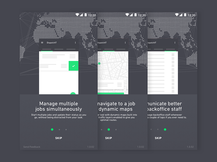
Walkthrough
I feel that even though a walkthrough is designed with the intention of helping people understand a product, it's still treated the same way we treat manuals that come bundled up with physical products — ignored and skipped. Regardless of this I feel that I have a responsibility to communicate benefits that in turn should ideally positively affect workflow habits.
The degree of complexity as well as the audience that would be using the product in question, were some of the considerations I took when deciding whether a walkthrough was worth my time or not.
To be perfectly honest, I'd like people to be able to inherently explore and not feel limited to a set of prescribed benefits as people use stuff differently and we can't just label user workflows and put them into one box.You can notice that within this shot I've tried to use some context-relevant illustrations (skeleton screens sorta) to kind of invoke early interest and begin to set expectations.
Of course this manifestation can go either way but I guess the user tests will help uncover any doubts we might be having.
