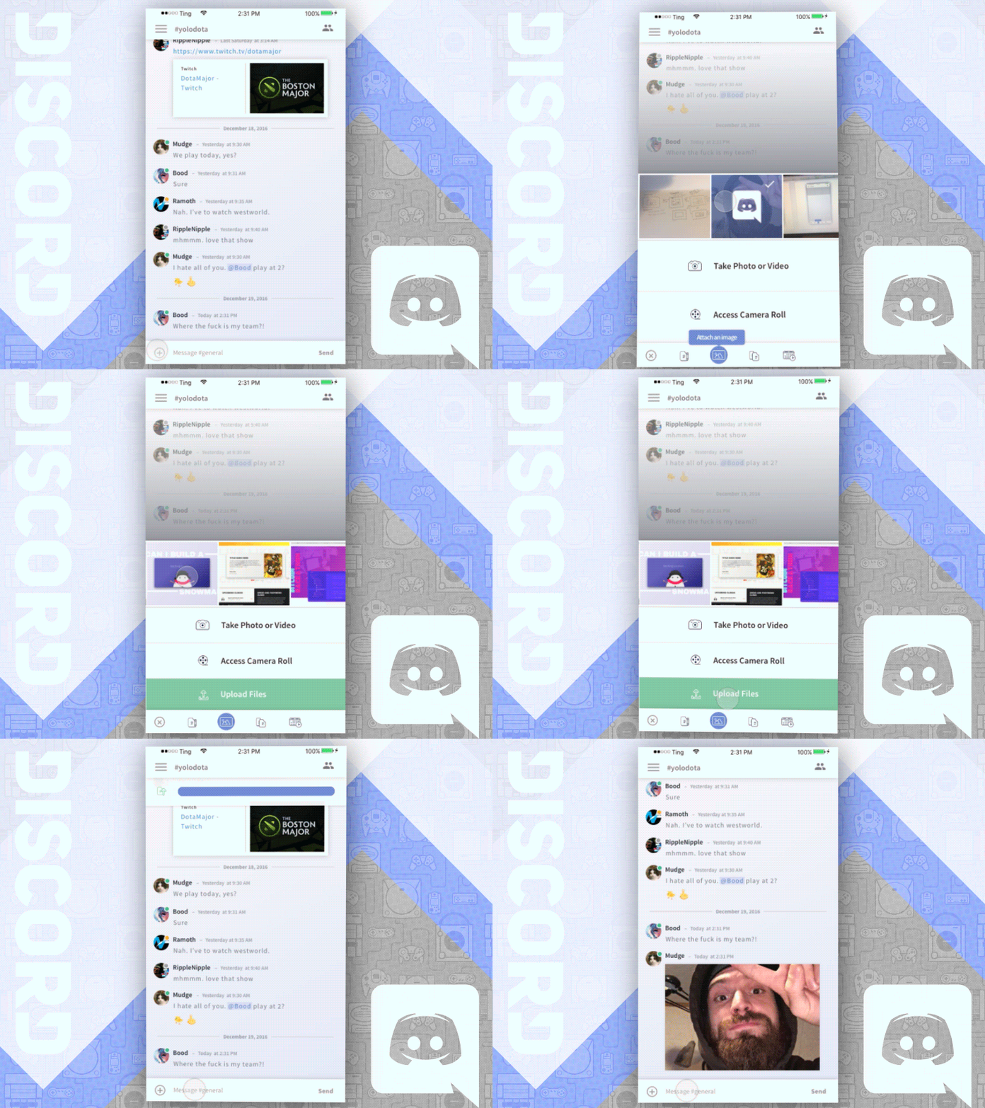
UI/UX Concept - Discord
I spend a lot of time using Discord chatting w/ my homies while sucking at dota... So I thought I'd take some time to put together a few screens – and fucks around w/ the UI.
For the UI I didn't want to steer too far from what already exists because it's money in terms of functional minimalism. I incorporated subtle shadows/gradients to make it feel a bit more lively and a little less flat.
For the icons: I used Google's Material icons for Main icons and then put together custom icons in style of Discord's Emoji Menu Icons.
For this flow: The task here was to enable users to upload multiple files at once.
Future Flows:
- Write & Add Posts - I'm putting together screens to show how it might look if Discord had a Write Posts/Bulletin feature (ie: slack posts). It's debatable as to whether a feature like this is necessary but it could be useful tool for larger servers.
- Calendar / Session Add & Invite - I was thinking that this might be a cool addition for any serious amateur or pro teams to have the ability to coordinate play times around a schedule.
- Social Feed Among Friends - Not entirely sure how feasible something like this would be but the concept will be to pull in recent activity / accomplishments from friends and display that data in an interactive newsfeed (comments, likes, and other social bullshit).
------
As always, I'm looking join a team of humans who can teach me how to become elitehackmasterpro.
If you know anyone let them know I'm cool.


