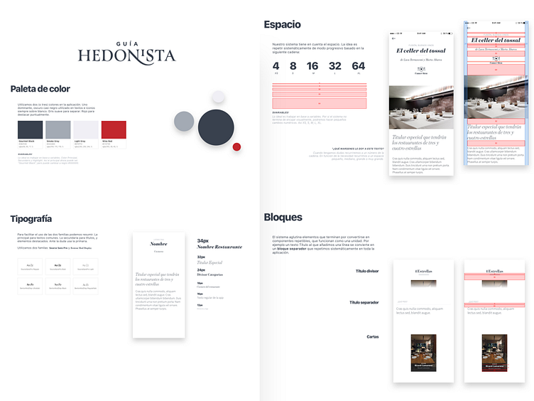
App Style Guide - Guia Hedonista
Recently I've been embarked on an awesome project. This is a piece that shows of the journey to document the visual language and design system with an easy-to read documentation. 4 colors, 2 fonts, 8 point system, some blocks, spacing, icons, copy language and few more things are included in the documentation, always in context -how important is context. Trying to keep things simple, intuitive and beautiful.
More by Carlos March View profile
Like
