BI Boards

Fall 2015 //
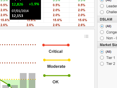
Contracted to design and implement some BI dashboards for a cable provider in the northern US. This particular dash measured what's known as "churn rate", it's the amount of people dropping the service. So a decrease in churn is a good thing, while an increase would be bad. There's so much going on but the goal was to paint a clear but high-level picture of the territory status. As with any exercise in data visualization the object is to tell a story, for better or worse.
