Spotify Artist Page Redesign
My first shot! Hello Dribbble :)
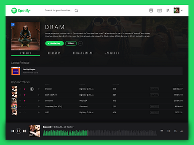
Something I did as a personal project. I felt like the current Spotify web app really struggled with a proper hierarchy which makes it somewhat difficult to navigate.
I changed the layout from horizontal to vertical to make it more web-standard and familiar feeling. Then used Spotify's current colors to build a better visual hierarchy. The white header helps a user find their starting point, but as your eyes move down the page, it disappears as you focus on the darker content.
More by Via Union View profile
Like


