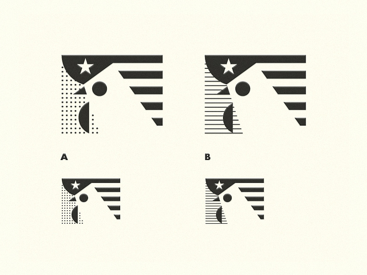
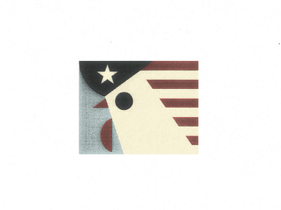
HELP: dots or lines?
Guys what's the way better for a monochromatic version? Dots are difficult to align due to the neck's angle but I like the visual perception in small size. Lines follow the horizontal orientation of the stripes and maybe help to get the negative space more neat.
Final version will be in letterpress.
Thanks in advance for any help! :>
More by vacaliebres View profile
Like

