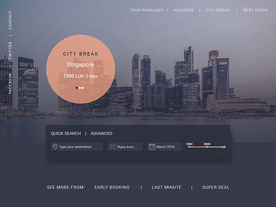
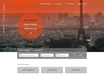
Travel booking landing page, dark UI
I always preferred light interfaces and it is a challenge for me to use dark colors. Also, I found interesting how much affect the design the color palette.
What do you think? You'd use dark colors for landing pages?
More by Madalina Taina View profile
Like


