UX Improv #1 - Amazon Prime Video (1/3)
Starting a new series on Dribbble - "UX Improv" where I'll start to prototype/ create a high fidelity mockup of an app that could be designed better and improve it's UX on the fly while creating the same.
With the release of Amazon Prime in India, the Android app still follows the same old Holo design from Android 4.4 Kitkat. It was time to declutter the app, promote minimal design but improve the UX by a twofold.
The prime (you see what I did there?) reason of most users visiting the app is to see a movie/series they've been following or discover new. Considering that there are interruptions and the movie/episode is being watched on the mobile phone - it definitely means a lot of users will need to quit the app or leave the episode watched halfway.
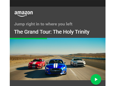
So, on the MainActivity itself, in the Home tab/bottom nav tab, we show the progress of the user on the previous video they watched and offer a small FAB to take them right to the part where they quit.
The benefit of this is that the state of the user is maintained not only on visiting a particular movie/series' page but featured on the home page as well for quick access. Also, this ensures that if the app ever is cleaned from the background - it keeps state information available on it's home screen minimizing the taps it would take normally.
