Chat
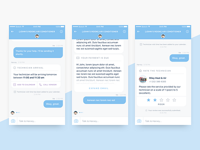
Chat screens for a property management app. Exploring different actionable card styles in order to make it simple and easy for the user to find all their apartment related requests in one place. The brief was to give the product a human feel and create a sense of comfort and belonging for the user. The distinction between a machine generated reply and human generated reply had to be maintained, so that the user clearly knows when they're talking to a human vs. when they're interacting with a machine.
--
Need help with your app's UI? We design simple, delightful and easy to use interfaces. Get in touch: info@flolab.co
More by Flolab View profile
Like

