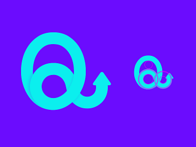
Quali App Logo
Over the past few months Ive been working on a tool that helps you monitor all your subscriptions and all your other recurring payments.
The app is called Quali-- short for qual·i·ty and here is the first iteration I made today for the logo. My goal here was to use vibrant colors so it feels unique and fun and I also played around with the curves and light shadows so it pops out a little bit. And the arrow pointing-up resembles the 'recurring subscription' symbol. Technically theres suppose to be two arrows chasing each other but I just didnt know how to add the other arrow but this will do for now.
Also the name or logo is not set in stone but I wanted to explore some ideas now so I can start designing the product visually in my head before we get to that stage. Right now we're more focused on the core product and user testing.
If you're interested in testing the product or if you have any questions, please contact me! Thanks guys.
my twitter
https://twitter.com/Captnphilip
