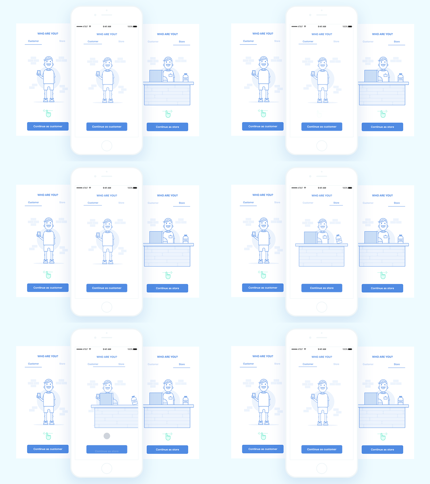
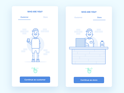
Animated onboarding for ecommerce application
Hi dribbblers, great week to everyone!
Here is the sample of transition which we came up with during work on registration flow. First, it was a plain screen with two buttons— for users and customers. But after reconsidering the result, I've decided to make it more friendly with better context. To show in a more appealing way what is the difference between those users.
More pixels are here.
Our team wishes you all productive day!
Follow us:
More by Wimble View profile
Like

