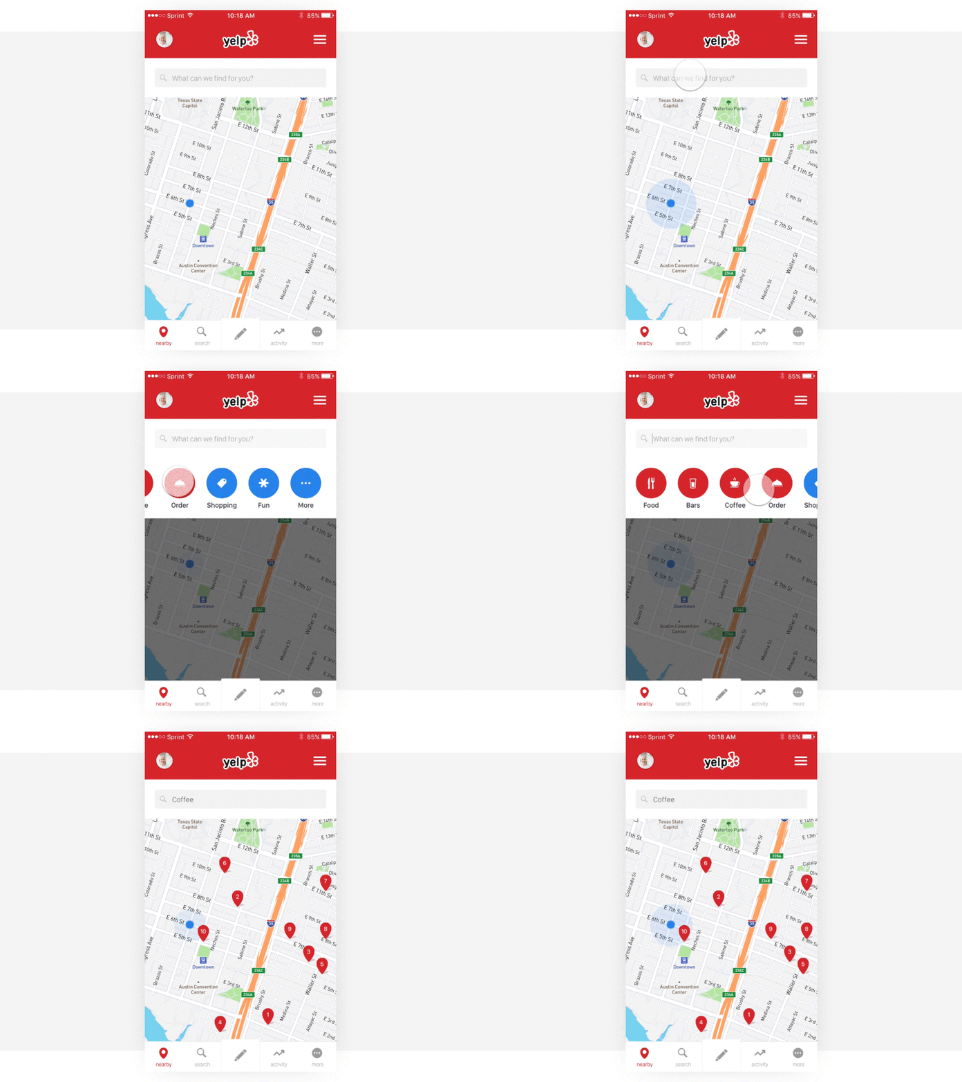
Yelp Redesign
Last week’s design exercise included rethinking the main screen of Yelp. If most people are like me, I use Yelp to search for restaurants, cafes, and events near me. With this redesign, I focused on reducing distractions and directing users to the search bar — enabling them to quickly discover what they are looking for without typing a word.
--- Looking for a design partner to help with your mobile app or web-based digital product? Share your story with us – we'd love to hear from you and start the conversation. Email us hello@wearemighty.co
More by Mighty. View profile
Like
