NOVA
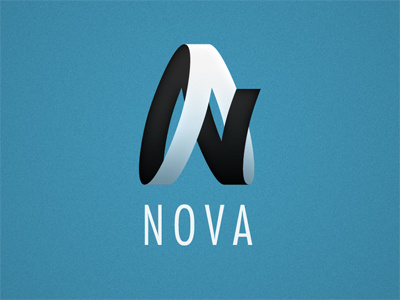
This was unused concept for a client. It's based off of a mobius strip, and I really liked the abstract letterforms I made. The original logo had a slightly different 4-letter name (including an A and N), but I thought 'NOVA' was more appropriate because this mark gives me an 'aerospace' vibe.
Thoughts?
More by Rob Loukotka View profile
Like
