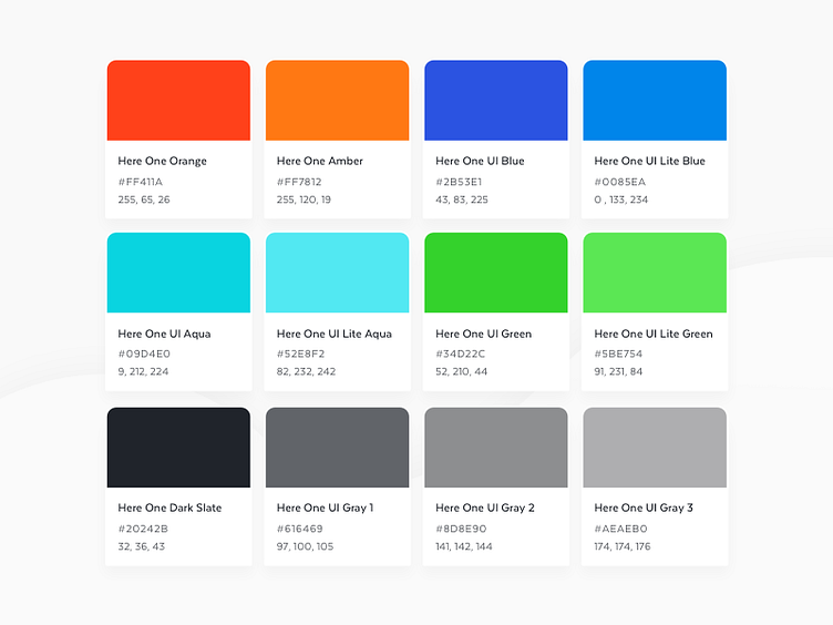
Here One App Style Guide - Colors
Putting together the style guide for the Here One app, and figured I'd share the color palette that we ended up with. Really wanted refreshing color with good contrast, that also paired nicely with our brand look & feel. I'll try and post more from the style guide soon!
More by Sean F View profile
Like
