Cars
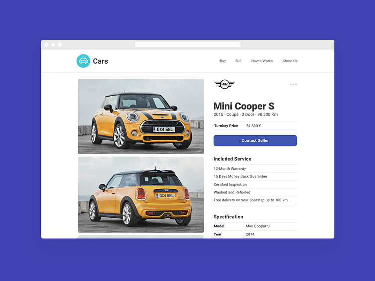
Initially we though about using a common slideshow with the car pictures, but that wasn't fast enough for something people do so often on all the pages. So we opted for a two column layout where we showcase the car on the left and the details on the right. This way the interaction is simple to understand and the information is presented in a clear way.
You can check the full project on Behance here: https://www.behance.net/gallery/45963525/Car-Market-Redesign
More by Igor Pascoal View profile
Like
