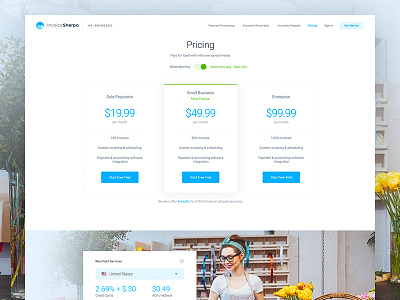
Invoice Sherpa - Pricing
Hya Everybody,
So which fine dame fits better on the pricing page? I think the first image kinda has more "action" to it, there is more background noise and lifts up the whole page. The second one maybe has a better fit with the overall "styleguide" with the blue shirt. What's your opinion here?
Design: @Filip Justić
Give us a follow if you have time to spare, we appreciate it!
More by Balkan Brothers View profile
Services by Balkan Brothers
Like


