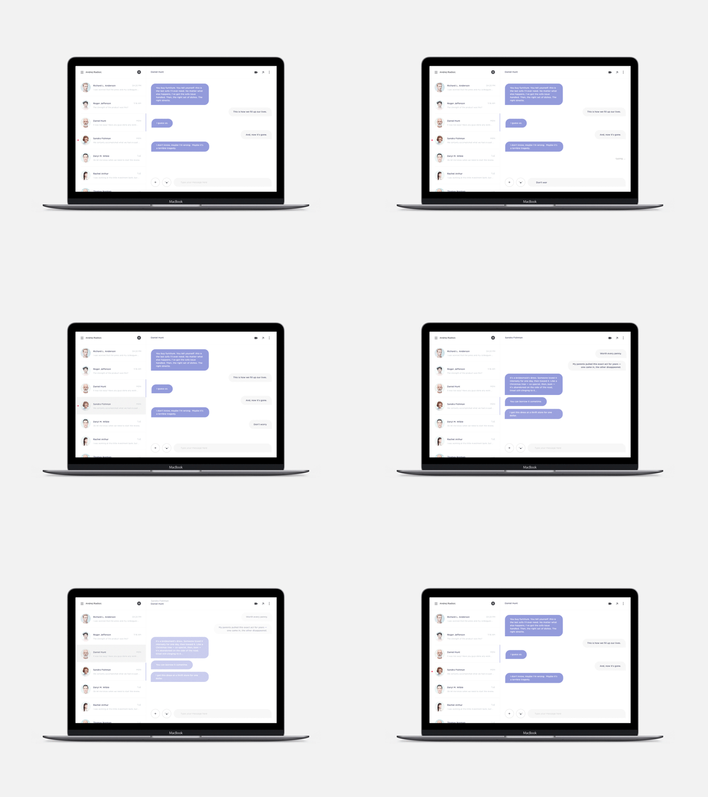
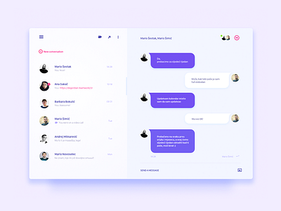
Chat module / UI Challenge
This week was fun, there is a lot of ways you can go with this one, tried to keep it simple, chatting should be simple and inviting.
Wanted to have something that is more playful and fresh. Used Gotham rounded and made some custom icons to get that oval feel, added a more detailed view for all of you that like to zoom in.
Shout out to the talented people @Degordian and everyone rebounding, hope you all had fun with this one as I did.
More by Andrej Radisic View profile
Like


