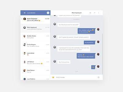
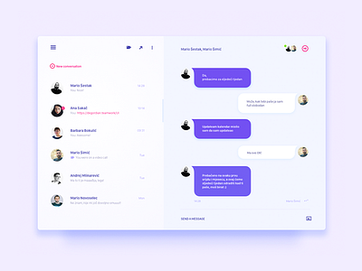
Chat module / UI Challenge
So @Mario Šestak from @Degordian threw this weekly UI challenge thing my way, and honestly it's pretty good to work freely and compare yourself to your peers.
The things I wanted to improve upon in this week's challenge were some of the more janky elements in the google hangouts desktop interface.
The typography is a bit stark, the lists are a bit crowded and I think UX-wise, the "New conversation" action could be reduced in importance. In addition there wasn't a clear indicator of which conversation in the list is currently active. You can take a more detailed look in the attachment. 🔍
Hey, contact us and follow Bien on Instagram. 👋
More by Bien View profile
Like


