Being Mom & Dad
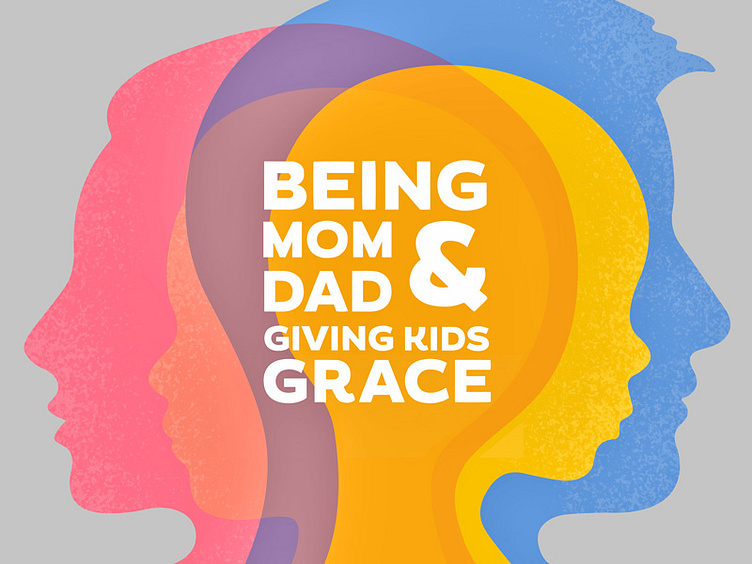
Branding support design word lockup for a ministry — they ended up not wanting to use any color bc they didn't want it to come across masculine or feminine, but idk. I liked the color and overlays tbh.
Also, I did not originally create all of the silhouettes, just partially simplified, refined and cleaned up some existing ones.
The client ended up going with just a black and white version of the text lockup. : |
=)