Cruise Ship EHR
Spring 2012 // TL;DR
The thing about contracting is that most times you are coming into an existing product and style-guide. Please, just know I was not responsible for the 250px navigational icons. Those are branding guidelines handed down from a legacy system, I cannot change this only work around it.
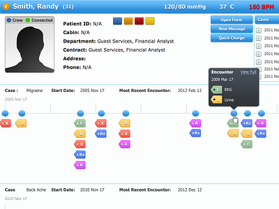
While working at IOS Health Systems in Miami I was brought on to work on a very specific piece. The company had just won an RFP bid from Norwegian Cruise Lines to design, develop, and implement an on-board EHR. It was probably one of the most rewarding experiences of my young software design career. This was the first time I was able to sit side by side with a physician (also contracted to the company for this project) and derive specifications and requirements to the system. One of the major problems conveyed to me was that doctors often only have a snapshot in time of the patient's health. The real trick, he said, would be to see an aggregated timeline of a person's health activity.
Now most designers will hear "timeline" and immediately think of a reverse chronological sequence of events stacked up along the y axis (like FB, T, etc.) However if you look at this design you will see we laid it out along the X axis. It would require some dreaded horizontal scrolling but the user's got it. Essentially all those little colored tags stand for something performed on the patient.
One more thing, this particular platform had to track Crew and Guests and had separate UI's roles/permissions/dashboard available to them.


