Employee card
Hi there!
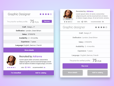
This is a recent redesign of mine. Here is the thought process that I had while working on this:
1. Change of colors of the buttons and stars. - The purpose of this change was to make the card more clear to the user. Too many elements of the same color could potentially be confusing for the final user.
2. Removal of „I’m interested” button. - The reason for this was to have the least amount of buttons. The ‚I’m interested” button is moved to another screen of the website.
3. Cleaning up the design of the card (removal of the stripes under the specification panel, addition of 1 px lines between each specification category, change of entire text color)- It’s motivated by the fact that the users focus must be quickly caught in order to guarantee understanding. The clarity makes the user experience pleasant.
4. Placement alternation of the recruiter section.- It is important to keep the buttons together.