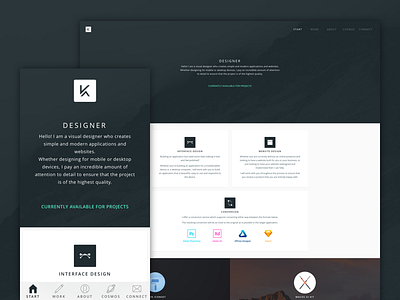
KeirAnsell (.com)
Designing your own website is probably one of the most painful processes.
Countless iterations, designs discarded for the slightest thing but eventually I got there and finished one.
As I managed to keep the number of pages low enough, I decided to go for a Tab Bar for mobile navigation avoiding having to even think about a Hamburger menu ;)
Even better, I was able to use CSS3's backdrop filters so on iOS, it nicely blurs everything behind it giving it a little bit of a native vibe.
There's still some area's I need to flesh out and tweak but it's done to the point where I was happy to get it online rather than keep putting it off and tweaking it for eternity.
More by Keir Ansell View profile
Like
