Filling the Emptiness
Whilst designing any digital product, it's extremely important to consider if/when the user may be presented with an area/page that does not have any content.
This may be because they're brand new to the service, and have not yet populated this area themselves, or perhaps they've cleared the space in a positive way (e.g To-Do list).
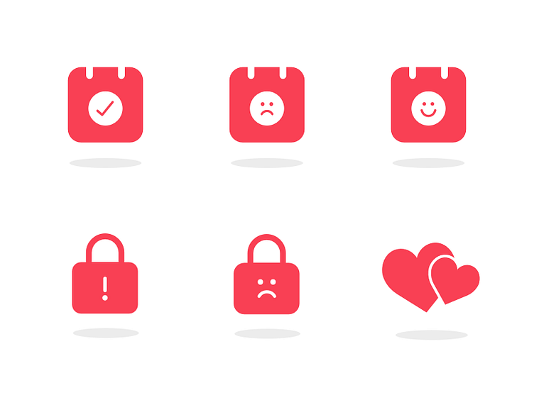
Here are some very simple illustrations used to fill some empty states in an app we're currently building, which, with some accompanying text tell users why it's empty.
More by hedgehog lab View profile
Like
